The Best General Contractor Websites (and What Makes Them So Great!)
Do you remember the first job you had? Or first time your met your spouse's family?
There are more examples but if you're like me, you probably had that voice in your head repeatedly saying, "Firm handshake, firm handshake, don't forget the firm handshake."
Why? Because first impressions matter.
As a general contractor, you need to think of your website as a firm handshake — that first (hopefully good) impression.
Given that the average human attention span of 8.25 seconds, it's critical that the first impression your website has on potential customers is positive and strong.
We’ve compiled a list of awesome contractor software and websites that showcase unique features and design elements that set them apart in the industry. Keep scrolling and we'll share what you need to do exactly that!
If you stopped scrolling right now, here are the key takeaways I'd want to you leave with:
-
You don't have to start from scratch! Check out these examples for inspiration as you explore what you want your general contractor website to look like.
-
It's easy to overlook reputation marketing on your website. Existing reviews act as free advertising (and we'll show you how to automate the review generation process to always have a steady stream of social proof coming in).
-
While you may feel rushed to get a website up and running, always assess the portfolio and experience of the website-building companies you're researching. (The website may look aesthetically pleasing, but do they actually convert the leads who land there?)
Why you need to care about your company website (and online presence)
You know that saying, "If a tree falls in the forest and there's no one around to hear it, does it make a sound?"
It makes sense in this context, so bear with me. 😅
Let's say you do the highest quality general contracting work for a client, but no one can find you because you don't have an online presence such as Google Business Profile, online reviews, or a website.
This is problematic because even if you do great work but there's no way for people to know that and decide for themselves, is your work really great?
I admit the metaphor only goes so far before falling apart, but you can't dismiss modern-day customer behavior. Because those potential customers take online presence seriously and do things like read an average of 10 reviews before committing to a company.
If you're not meeting your target market where they are, you'll struggle with contractor lead generation and business growth.
5 Great examples of general contractor websites to inspire your own

In today’s competitive general contracting market, having a high-quality and high-converting website is crucial for attracting new clients and showcasing your expertise. We’ve carefully evaluated a variety of contractor websites, considering factors such as clear value propositions, calls to action (CTAs), trust signals, visuals, and more.
Let’s dive into our list of the best general contractor websites and discuss the elements that make them truly exceptional.
If you want a quick look at every website in this list's homepage, I recorded a quick video scrolling through them for you:
1. TruLift Concrete Repair
TruLift Concrete Repair’s website stands out with its clear hero section, simple user experience, and clean layout. The modern design appeals to website visitors, effortlessly guiding them through the site.
This exceptional user experience showcases the construction company’s expertise and past projects, making it an excellent example for others in the industry.
-
Clear Value Proposition: The website prominently displays the company's services and offers a clear value proposition with a focus on lifting concrete and foundation repair in Rock Hill, South Carolina (and surrounding areas).
-
Call-to-Action (CTA): There are two prominent CTAs encouraging visitors to take action: "Book now!" and "Get a free estimate!" In either case, they'll collect high quality leads who are ready or almost ready to convert.
-
Services offered: Both in the global navigation and right below the hero, TruLift shares exactly what they offer when it comes to needing concrete solutions. This is especially helpful because hyper-focusing on what they do effectively weeds out the people they can't help.
-
Trust Signals: TruLift showcases trust-building elements like online reviews/testimonials, instilling confidence in their services. On the homepage, they have three specific Google reviews focused on some of their value props: quality work, professional, and veteran discounts. They also have a specific Reviews page with a hero image of the business owner and his daughter to emphasize his trust in the Rock Hill, SC community. On that same page, TruLift Concrete Repair is able to aggregate and display every online review they receive from Google and Facebook, in one place.
-
Visuals: High-quality images of completed projects help showcase their work.
-
Contact Information: Contact details are easily accessible, making it convenient for prospects to get in touch.
2. Capital Concrete and Fencing

Capital Concrete and Fencing’s website boasts a strong hero image that immediately captures the attention of potential clients. Why? Because it's a beautiful image of past work they've done.
This combination of visually appealing design and valuable content makes Capital Concrete and Fencing an excellent example of a high-converting contractor website.
-
Engaging Headline: The headline is engaging and clearly states their primary services, i.e., "concrete and fencing services in the greater OKC and surrounding areas." Capital Concrete & Fencing also follow the clear offering up with a description of their company, which is "the most trusted and dependable team of hardworking concrete specialists in the Greater OKC area!"
-
CTA: The "Free Estimate" and "Get Quote" CTA buttons are both bright red and stand out as the desired action that they want website visitors to take. For those who want a bit more detail, their secondary "Call Now" CTA makes it easy for people to get the answers they need before making a choice.
-
Visuals: Capital Concrete & Fencing feature high-quality images of their work across their site, giving prospects a clear idea of what to expect. This approach is wise because they're able to show what their concrete services, customer fencing building, outdoor living spaces, and epoxy coating work all looks like.
-
Testimonials: In additional to a section covering why you should choose their business over other companies, this concrete and fencing services company also includes a page that houses all of their "brilliant reviews from in and around the greater OKC."
-
Service Highlights: The site provides clear highlights of their services, which helps prospects quickly understand what they offer. On their homepage, Capital Concrete & Fencing has a specific section that highlights their core services that each link out to a specific service page, outlining the specifics for fencing solutions as an example, where you can explore wood fencing, chain link, decorative fencings and design, metal fencing, and vinyl fencing services.
3. Rosewood Home Services

The Rosewood Home Services website excels in showcasing their diverse range of services and impressive portfolio. The luxurious dark and gold color scheme reflects their high-end clientele, while the easy-to-navigate site allows potential clients to explore their projects and expertise.
This well-rounded construction business website demonstrates how a strong online presence can attract new business for construction companies, making construction websites, including a construction company site, an essential tool for every business owner in the contracting business.
-
Strong Branding: The website has a consistent and appealing color scheme and branding that aligns with their industry. According to Designs.ai, maroon (or the red rust color that Rosewood Home Services uses) is commonly associated with force, depth, and passion. For me, it's the "passion" that comes through on this website. From the messaging to the visually appealing backyard oasis images they use, you can feel the passion this company puts into their work.
-
CTA: The main call to actions that Rosewood Home Services has are "Get my free estimate!" and "Free quote!" Assuming a free quote or estimate is what they want (or expect) visitors to request from them, they're on the right track to effectively generate leads on their website!
-
Service Categories: Under their "What we do" section in the global navigation, they outline two of their top-rated services: deck building and porch building — each leading to more information about that specific offering. page about They present their services in well-organized categories, making it easy for prospects to find what they need.
-
Visual Portfolio: High-quality images of their work are showcased in a section covering their "Latest Projects". A section like this is fantastic because potential customers can see what Rosewood Home Services' work looks like in the real world; they can them walking the walk.
-
Customer Reviews: On the Rosewood Home Services homepage, they have two sections with positive 5-star Google reviews from satisfied customers that help build trust. On top of that, they've got a dedicated online reviews page, pulling happy customers thoughts from Google, Facebook, and more. They've also got Angi and Better Business Bureau badges that they've received for Super Service Awards and other high-quality work recognition.
4. Airtegrity Comfort Solutions
Airtegrity Comfort Solutions’ website emphasizes their commitment to clean site standards and offers informative content for potential clients. The clean and modern design, along with the wealth of helpful information, positions Airtegrity Comfort Solutions as a trusted and reliable choice for homeowners seeking a remodelling contractor.
-
Clear Headline: The headline and description on the hero section of Airtegrity's homepage is effective and clear: "Your Local AC & Heating Experts: Resdential HVAC Repairs in San Antonia, TX." The choice lead with "Your" is a great way to personalize your homepage and, in essence, talk with your customer. They also decided to go with an on-the-job video which gives potential customers a look into their day-to-day and what a job on their own property could look like! In short, a great way to build trust and authority, and affirm that they know what they're doing.
-
CTA: "Schedule My Service Now!" and "Book Now!" CTA buttons are prominently displayed, encouraging visitors to take action.
-
Service Details: This section stands out a lot to me because Airtegrity Comfort Solutions highlights the customer's pain point. For example, they open that website section with: "Do you find it hard to get a hold of a trustworthy HVAC contractor? Maybe they don't return your calls or show up when they say they will." Against this negative backdrop, this company is able to position themselves are the polar opposite of what they just described. Doing this helps build a sense of trust and hope that Airtegrity will give them exactly what they need for their home — i.e., detailed information about their services, addressing potential questions and concerns around new system installations, high-quality repairs, and AC system maintenance.
-
Trust Elements: While Airtegrity doesn't display any industry certifications or affiliations, their services section is followed immediately with a glowing 5-star testimonial speaking to their exceptional professionalism, prompt service, and outstanding communication. In addition to their dedicated reviews page, Airtegrity's images don't just emphasize their projects. They showcase the workers who do the work, front and centre.
-
Contact Information: In addition to the primary CTA, they've also contact details such as their phone number clearly displayed for customers seeking more information, their address, as well as their license number.
5. Married 2 Electric

Married 2 Electric’s website is bold and eye-catching, from the standout logo to the brand colors of choice — let's dig into what make this general contractor website a strong contender.
-
Unique Branding: The website has a unique and memorable theme that aligns with the electrician industry. The black, red, and white design creates a strong contrast that really commands the website visitor's attention. The logo's artistic style also looks like a more traditional bold line art style, which creates a sense of authority. Like they've been around for a long time. The hero section copy compliments this well, too, by positioning Married 2 Electric as "EXPERIENCED ELECTRICIAN SERVICES IN POTTSTOWN, PA: Where Passion Meets Proficiency."
-
CTA: Married 2 Electric has two versions of the same call to action on their website: "Get Estimate!" and "Get My Free Estimate Now!" They're red, bold, and make it clear for visitors what next step they need to take.
-
Service Highlights: They list their services with clear relevant icons for easy scanning. Married 2 Electric is clear, telling visitors "HERE'S WHAT WE DO" and goes on to emphasize their work is geared toward residential projects and that they do general electrical services, lighting fixtures and ceiling fans, electrical repair and trouble shooting, electric car charging, generator installation and repair, as well as electrical panel and service upgrades. To top it all off, each one links to a specific service page so that they can give prospects even more info and further build trust.
-
Visuals: Compared to the other general contractor websites we've shared, the Married 2 Electric homepage uses high-quality images that look more like stock photos than on-the-job photos. But I think the reason it works in the context of their website is because they show close-up shots of electric-related images like someone handling wires as opposed to an over-the-top "staged" photograph.
-
Trust Factors: Married 2 Electric shares online reviews on a dedicated page from platforms such as Google and Facebook and has a place where they share their latest projects, which makes up for the lack of on-the-job photos elsewhere on their website. On their homepage, they also have a section ensuring prospective customers that Married 2 Electric provides emergency support, 24 hours a day, 365 days a year. Plus, they're licensed and insured, which is another big plus for people looking to have electrical work done on their home.
What do those general contracting websites have in common?

They're all examples of live in-the-wild NiceJob Sites. We guarantee that when you choose NiceJob to build your website, you will win 10% or more website sales — or it’s free!
The dedicated customer review pages that each of those Sites use is thanks to the NiceJob stories widget, which is one of the many awesome Social Proof widgets that clients put on their website to help build trust, gain leads, and win new customers.
Check out the short video featuring Sean — he's awesome! — who'll walk you through how to easily market your online reviews, get more of them, and win more customers.
3 Essential features of a high-converting contractor website
Now that we’ve explored some of the best general contractor websites, let’s recap the essential features that make them successful.
Clear messaging and calls-to-action
Clear calls-to-action are vital for guiding users towards desired actions on your contractor website. Effective calls-to-action use strong verbs, evoke emotion or enthusiasm, and give your audience a reason to take the desired action. Examples of effective calls-to-action include “Sign Up Now,” “Download Now,” “Get Started Today,” and “Learn More.”
By incorporating these elements, you can increase lead generation and ultimately attract more customers to your construction business.
Trust-building social proof
Establishing trust with potential clients is crucial for a successful contractor website. Trust-building elements, such as testimonials, certifications, and professional website design, can create a sense of reliability and credibility for your construction business.
Use these elements on your website to effectively showcase your expertise and attract potential clients who are confident in your ability to deliver quality results.
Mobile-friendly design
Remember when people used to read newspapers? Not anymore! Almost everyone's using mobile devices to do research — including folks looking for a top-rated general contractor. With a majority of organic search engine results coming from mobile devices, your website will have to load quickly and provide a positive user experience on all devices if you want to successfully compete for clients.
A mobile-friendly design not only improves accessibility for potential clients, but also contributes to better search engine rankings through effective search engine optimization, making your website more visible on search engines.
3 Tips for choosing a company for your general contractor company's website

Selecting the right web design company for your construction business is a critical decision that can greatly impact your online presence. To ensure you make the best choice, consider factors such as assessing the company’s portfolio and experience, effective communication and collaboration, and budget and timeline considerations.
By taking these factors into account, you can choose a web design company that will create a website that meets your construction business’s needs and attracts potential clients.
Assess portfolio and experience
When selecting a web design company, it’s important to review their portfolio and experience to ensure they have the expertise and skills necessary to create a high-quality construction website. Look for examples of past client work, pricing, client retention rate, and case studies to evaluate the company’s expertise and capabilities.
In our case study featuring David and Cheri Hanssen, the Owners of Kleencare, we highlight the success they've seen (and continue to see) by choosing Sites for their website needs.
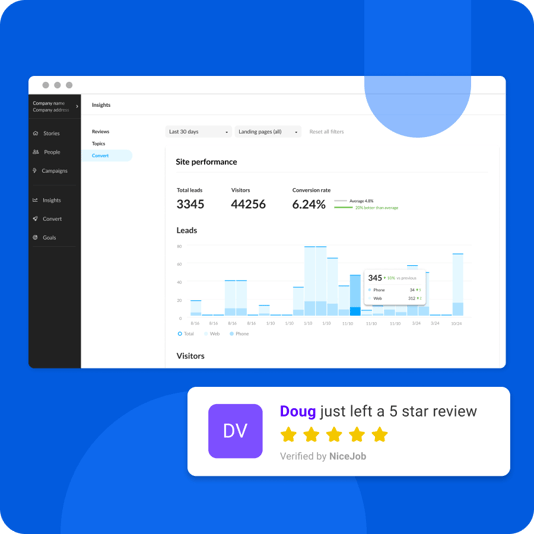
"And in the past year their website has enjoyed a 27.5% conversion rate, which is 23.7 percentage points higher than the industry average of 3.8%."
By thoroughly reviewing web design companies’ portfolios and experience, you can be confident in their ability to create a website that meets your construction business’s needs.
Communication and collaboration
Effective communication and collaboration are essential when selecting a web design company for your construction business. A smooth working relationship between your business and the web design company ensures that everyone is on the same page regarding project goals and expectations, leading to a more efficient and successful process.
Michael Collier from Display Your Way "[likes] how easy getting a beautifully created site can be. Working with NiceJob's customer service reps is also easy and submitting changes has been very seamless. NiceJob is a lot easier to use to get a website built that looks great. Otherwise I would have been stuck trying to build the website myself and I do not believe it would be half as nice."
To facilitate successful communication and collaboration, set clear expectations, establish a timeline, and utilize appropriate tools and technologies.
Budget and timeline considerations
Budget and timeline considerations are crucial factors when selecting a web design company for your construction business. Determine how much you’re willing to spend on your website, and consider the estimated timeline for completion.
Additionally, review the web design company’s pricing, case studies, and client retention rate to ensure they align with your budget and timeline requirements. By considering these factors, you can select a web design company that will create a high-quality website within your desired timeframe and budget.
Tuvia Davis of Visual Paint said, "NiceJob is everything you want in a website creator at a fraction of the price. They work with you every step of the way, they are responsive, and very quick to make the changes that you request. I would highly recommend NiceJob to anyone looking for a new website."
DIY vs. Professional Web Design for Contractors
When it comes to creating a contractor website, you have two main options:
-
Using a DIY website builder
-
Hiring a professional web design company.
Both options have their advantages and drawbacks, and the best choice for your construction business depends on your specific needs, preferences, and (probably most importantly) time.
Let's dig into the advantages and disadvantages.
Advantages of DIY Website Builders
DIY AI website builders offer several benefits for contractors, including affordability, ease of use, and full control over the design process. These builders often provide features like SEO, responsive design, hosting, and email support, making it easy for even those without web design experience to create a basic online presence.
However, it’s important to note that using a DIY website builder may not provide the same level of customization and professional design as hiring a web design company.
Drawbacks of DIY Website Builders
While DIY website builders offer some advantages, they also come with limitations. These builders often have limited design options, making it difficult to create a unique and professional-looking website. Additionally, DIY website builders may not offer technical support, making it challenging to troubleshoot issues that arise during the design process.
Backend technical limitations, cheap hosting, slow loading times, and strange URLs can also reduce credibility and make it harder for users to access the website.
Benefits of Hiring Professional Web Designers
Hiring professional web designers for your contractor website offers several advantages, including a customized, high-quality website that effectively showcases your construction business and generates leads. Professional designers have the expertise and creativity to craft a website that looks great, is easy to use, and is optimized for search engine rankings.
Additionally, working with a professional web design company ensures that your website works perfectly across all major browsers and devices, further enhancing the user experience.
Where NiceJob shines
On top of hitting all of the key points I've shared above, it's NiceJob's "10% more website sales or it's free" guarantee that truly sets us apart from other website builders.

Yes, our Sites team builds beautiful websites and puts hours a week back into the schedules of local business owners time. But it's the proven high-converting performance that gives people like you the most value.
Ready for a website that makes your business shine online?
Have your professional team of developers build one for you!
Learn More.png)


