Designing a Home Service Website: The Power of a Simple Font
*Disclaimer: Do not underestimate the power of your font choice for your website. By reading this you are aware and understand that your font can make or break your customer experience.
Sorry if that sounded harsh there, you guys! (I promise, it's not meant to!) Your font choice is important. And we're going to show you why that's the case and how you can pick the perfect font for your home service website. (If any point, designing your own home service website seems too big a task, give our design team a shout - we're happy to help!)
Why is font choice important in your website design?
Your website font is essential in communicating with your customers on your website. But how do you choose a font that will help you do this? It all starts with knowing your audience. And who better to know your audience, than you?
In addition, your font choice must be inline with what your customers are searching for. For example, if you are a cleaning business and select a busy, grunge-style font, this may be detrimental to your customer who is seeking cleanliness and simplicity. Little things to consider that can make a big difference to your audience. Here's how you can select a simple website font that works for your customers and your business.

An example of how a simple font choice can influence the overall feel of your website
Back it up, what are fonts anyway?
A font is a group of characters which come in a particular style and size and their purpose is to display text. When searching for fonts, you may also see the word 'typeface' referenced — but, what's the difference? A typeface is a collective name for the font family (e.g. Helvetica® is a typeface) while fonts are the styles and the weight of the characters within the typeface (e.g. Helvetica® Light). Sometimes they are used interchangeably. For the purpose of this article, we will refer to it as a font.
Let your branding be your guide
If you've worked with a designer to help design your brand, please use this as a foundation. Maybe you have some brand guidelines (if so, that’s fantastic!) or know which fonts your logo or marketing materials use (if not, your designer will be able to help you). It's important that your font is consistent across different platforms. This enables your brand to stay consistent and will help your customers recognize your business.
Make the most of font libraries & tools
The good news is there are various font libraries and tools out there for you to use. We’ll list a few below! Please make sure to check the font licensing for the font you choose and that you are allowed to use it for your website. Often, fonts are a form of software which you must purchase a license for.
Helpful advice: Be careful if you are downloading a free font for your website. It may only be for personal use, not commercial — so always check the licensing!
Some online font libraries include:
Helpful advice: If you are using Google Fonts, use the ‘Type something’ bar at the top of the page. Here, you can type in your preferred text to see how it looks and if it is ideal for your customers.
Choosing your font(s)
You may find a common theme in this article — always keep your audience in mind. When searching for a font to use for your website, think about what would work best for your audience.
For example, if your customers are seniors, it's important to look for a simple font that is legible and clear at larger sizes. In this circumstance, avoid using more decorative styles of fonts as they will be harder to read. It is also important to consider the color of the font itself and how this will contrast with the background of your website. If you have a font color that blends into the background of your website, this can deter website visitors as it will make it harder to read.
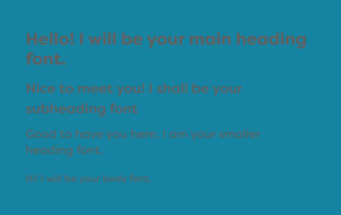 A darker font color on a darker background

A lighter font color on a darker background
The last thing you want to is turn away or deter website visitors because the readability of your website is poor. Even if something looks aesthetically pleasing, if it makes it hard for your customer to read, it’s not worth doing. Remember to also consider which devices your audience will be using to view your website. Make sure that you've selected a simple font that works, no matter what the device.
Helpful advice: When searching for fonts for your website, you’ll come across the terms Serif and Sans-Serif. What’s the difference? Serif fonts have a decorative line or ‘feet’ on their characters whereas Sans-Serif fonts do not. Depending on your audience and your branding, it may be that you use one of the two for your website font, or you may use both if they make a good pair.
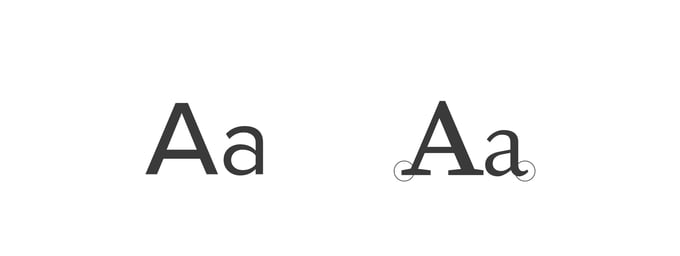
An example of a Sans-serif font on the left and a Serif font on the right
How many fonts should you choose?
I would not recommend selecting more than two fonts for your website. 1 to 2 simple fonts is enough to create a structure for your audience to follow (think of it as a newspaper!). More than 2 fonts can start to get confusing and lead to your audience not knowing where to look on the page.
If you’ve got a font in mind but are not sure it works well for your headings or paragraph text, there are a variety of font pairing tools which you can use as a font matchmaker. One of these matchmaking tools is FontPair.
Helpful advice: There's nothing wrong with sticking to one font (some fonts are happy to be single pringles!). They can work great for headings and paragraph text all on their own.

An example of having a variety of fonts for different text elements. Things can start to get pretty confusing!
Choosing your website font sizes & styles
You’ve selected your fonts. Now, you just need to determine which font sizes and styles you will use across your website. This lets you set defined, consistent styles, giving your website visitors a clear structure they can follow. It will also save you lots of time in the long-run as you'll have a guide to use in the future!
There are three things to think about here; font size, font style, and line-height. The font size is how large the characters will be when displayed on your website. It is often measured in points (pt) or in pixels (px) on computers. Line-height or line spacing is the vertical spacing between lines of text. This is important because it has a large impact on the overall readability of the text.
Have you ever noticed that sometimes spacing between paragraphs seem a little too close together? This can be amended by line-height. With line-height, it's important to make it bigger than the font size itself. For readability, try to aim for around 140% - 180% larger than your font size. So for example, if your font size is 32px, lets try multiplying this by 1.5 to get your line-height (and of course, you can adjust it accordingly!).
 An example of how line-height can affect the readability of the text on your website
Below is an example of a group of font sizes and styles for the desktop version of your website:
Main Headings (For your main titles)
- Font size: 32px
- Line-height: 48px
- Font style: Extra bold - Why extra bold? This will give your headings a very clear distinction to the main headings as they are not as heavy in weight and are smaller. But they are still notably larger than your main paragraph text.
Subheadings (For your service titles)
- Font size: 26px
- Line height: 39px
- Font style: Medium - Why medium? This will give your subheadings a clear distinction to the main headings as they are not as heavy in weight and are smaller. But they are still notably larger than your main paragraph text.
Paragraph text (Your main body text)
- Font size: 18px
- Line-height: 27px
- Font style: Normal - Why normal? This will give your paragraph text a clean and clear reading style that will allow your customers to read larger chunks of text with ease.
Link text (For hyperlinks in your paragraph text - this will likely be a different color too)
- Font size: 18px
- Line-height: 27px
- Font style: Medium - Why medium? If text links are in the main body of your text, having a medium font-weight will emphasize the links amongst the rest of the paragraph (so your audience knows it is clickable).
And, here's an example of these same website fonts on a mobile device:
Main Headings (For your main titles)
- Font size: 28px
- Line-height: 42px
- Font style: Bold - Why bold? Because your users will be viewing your website on a smaller device, bold is just enough for your headings to not display too harshly on a smaller screen but still stand out amongst your other font styles.
Subheadings (For service titles)
- Font size: 24px
- Line-height: 36px
- Font style: Medium
Paragraph text (Your main body text)
- Font size: 16px
- Line-height: 24px
- Font style: Light - Why light? A similar idea to having bold headings on mobile, light will just ensure that the paragraph text is still easy and clear to read and not too harsh on the eye. (Please note, normal could work just fine too — it just depends on the font)
Link text (For hyperlinks in your paragraph text - this will likely be a different color too)
- Font size: 16px
- Line-height: 24px
- Font style: Normal - Why normal? It will contrast nicely to the light body text so that it is still emphasized but not so much so that it looks out of place.
Those are some examples of font styles and sizes you could have for your website. Depending on the font you are using, you might need to have smaller heading sizes or larger body text. Also remember how your website will be displayed on different devices, so what may work on desktop, may not work on mobile (just remember to amend these based on the device!).
Helpful advice: For longer lines of text, try to limit the amount of characters to 40 - 60 characters. This makes it easier to read and digest.
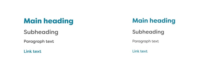 Desktop font styles on the left and mobile font styles on the right
Summary
Typography and website fonts is a vast subject, without a doubt! We've selected some key things to consider when thinking about picking a simple font for your website which will help you to effectively communicate with your customers.
Just remember, always think about your audience. Readability is key!
And, if you need a hand or have any questions, please feel free to reach out to a member of our design team at NiceJob - we're always happy to help!
Need an affordable website for your business?
A website built by NiceJob guarantees to increase lead generation by at least 10% within three months—or it’s free.
Learn More
*** Blog thumbnail photo by Alexander Andrews on Unsplash
*** Blog main hero photo by Markus Spiske on Unsplash


